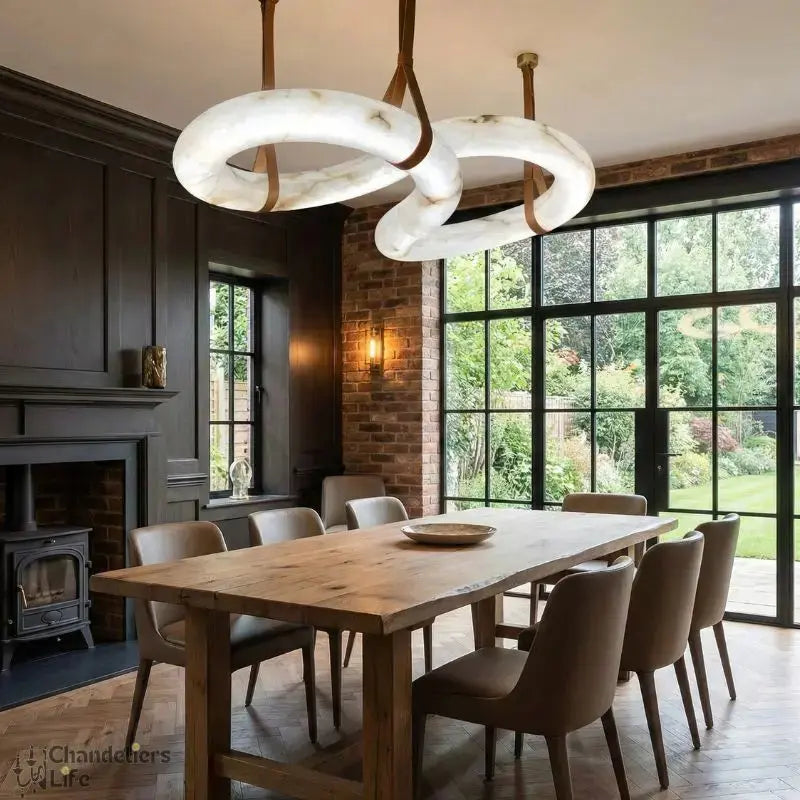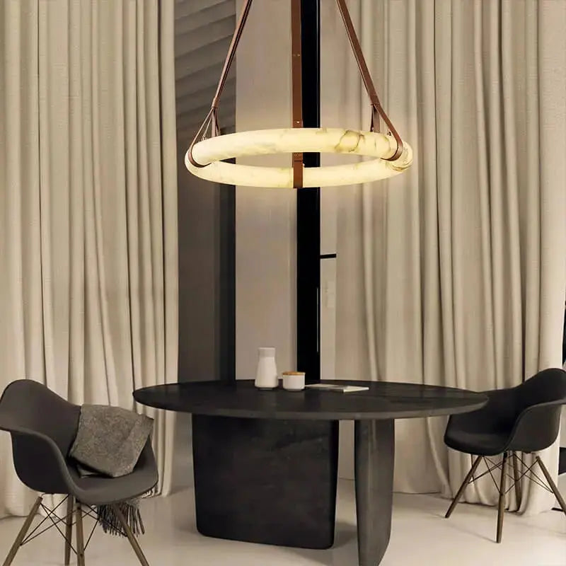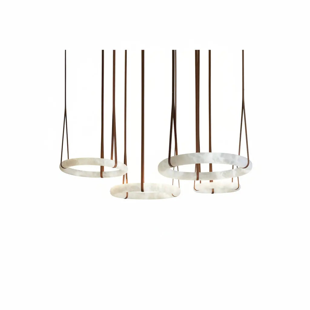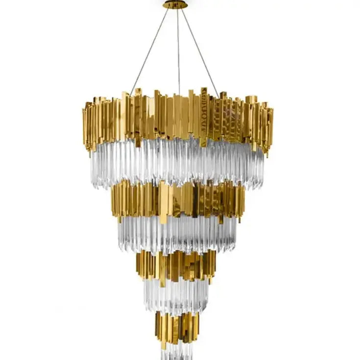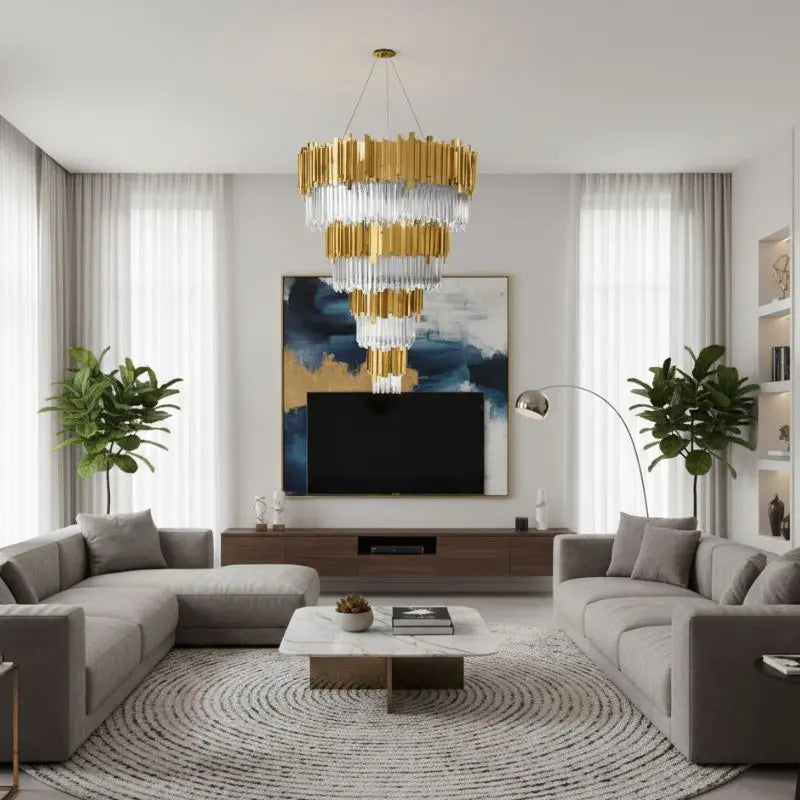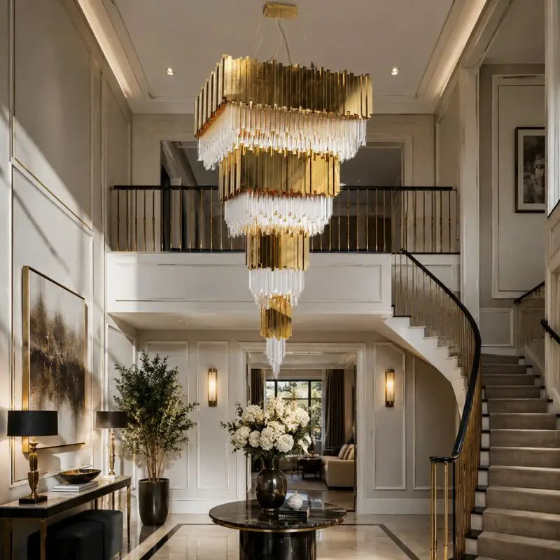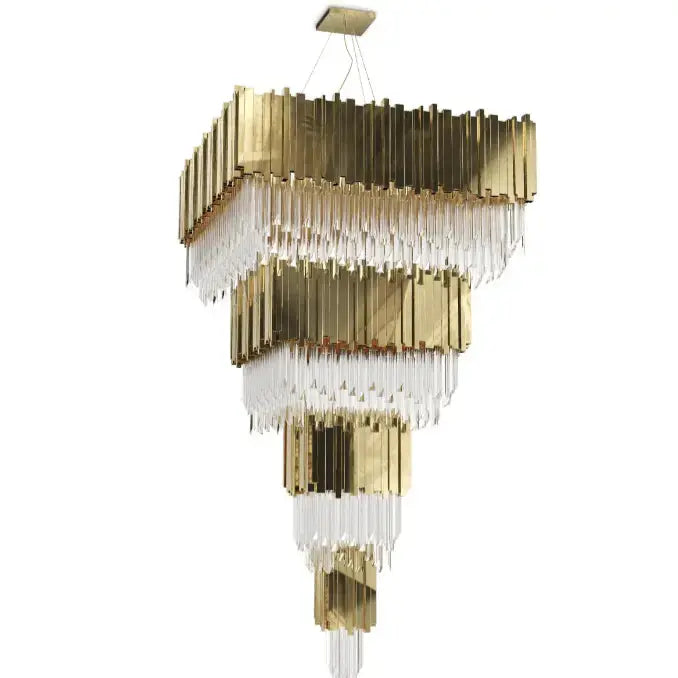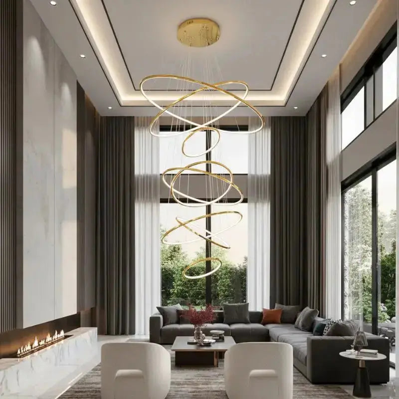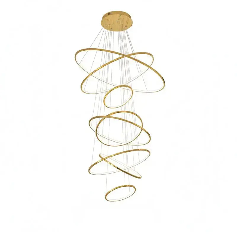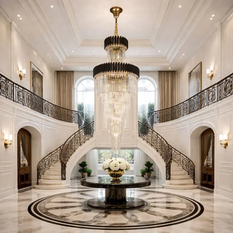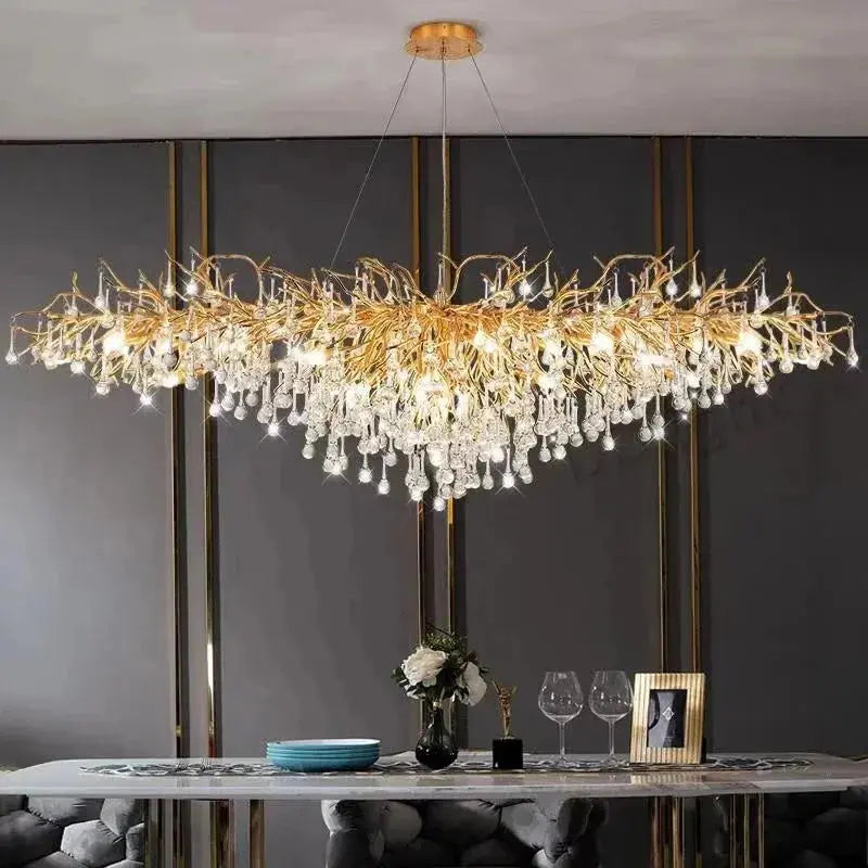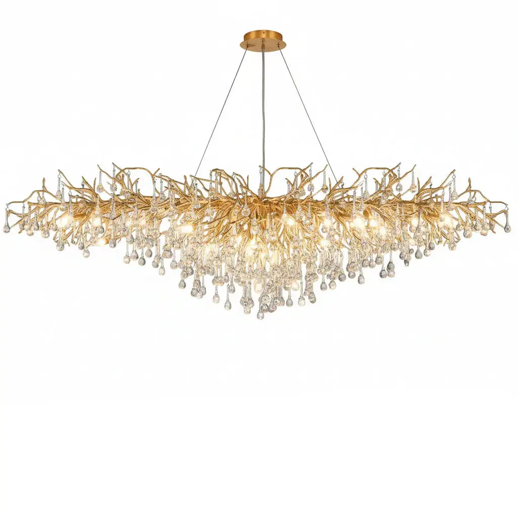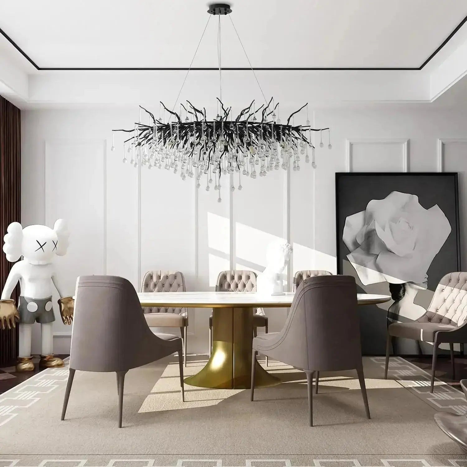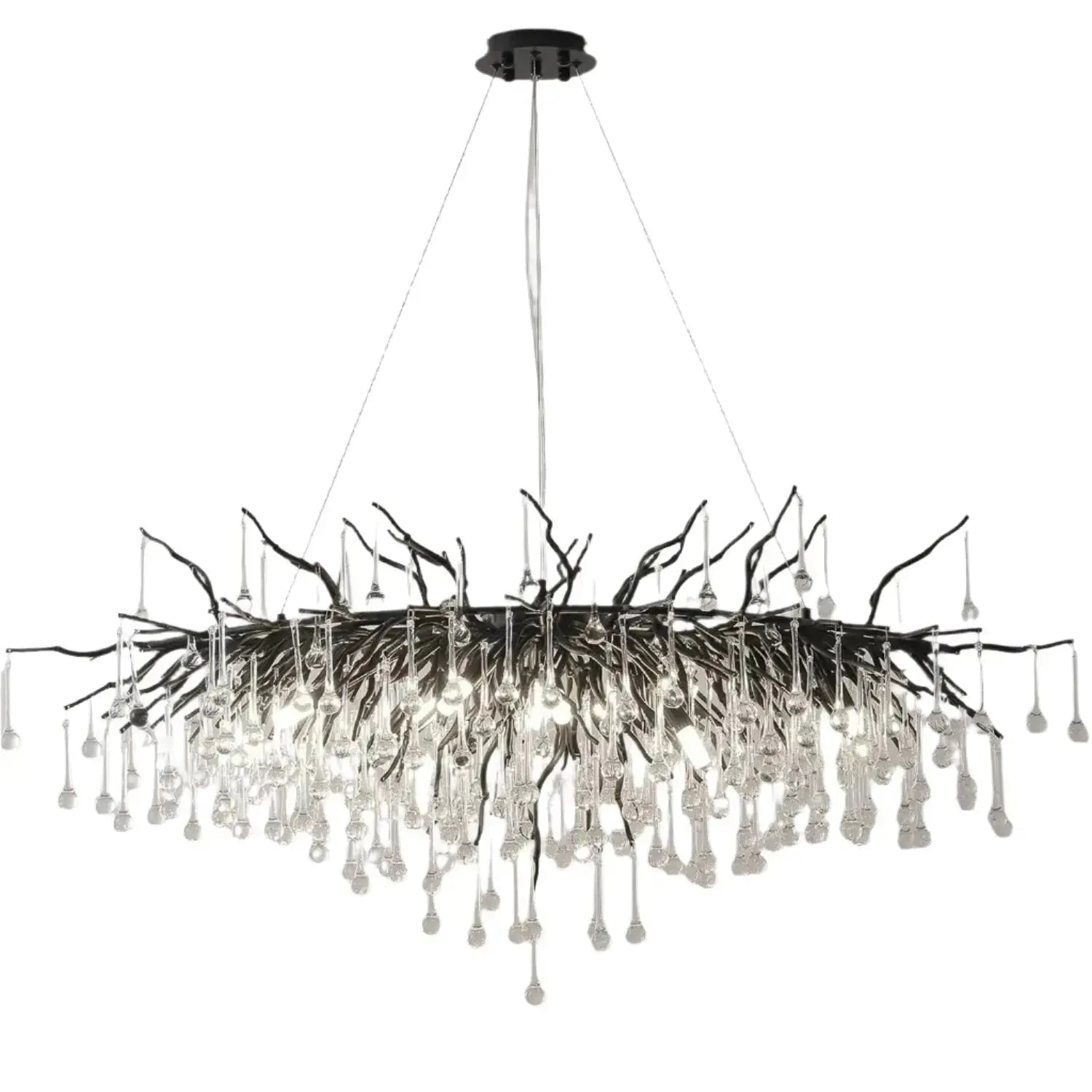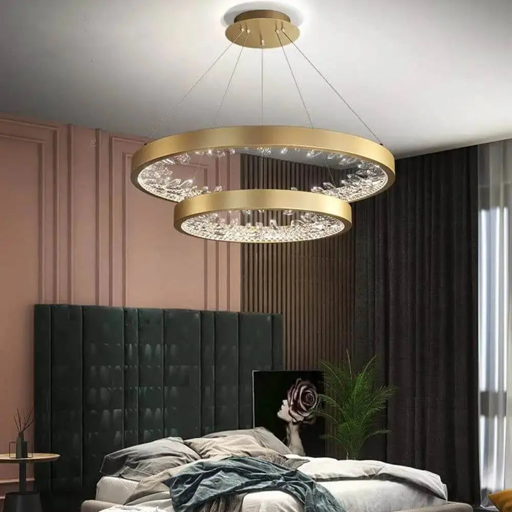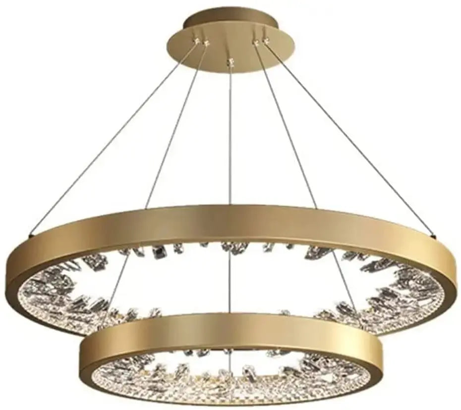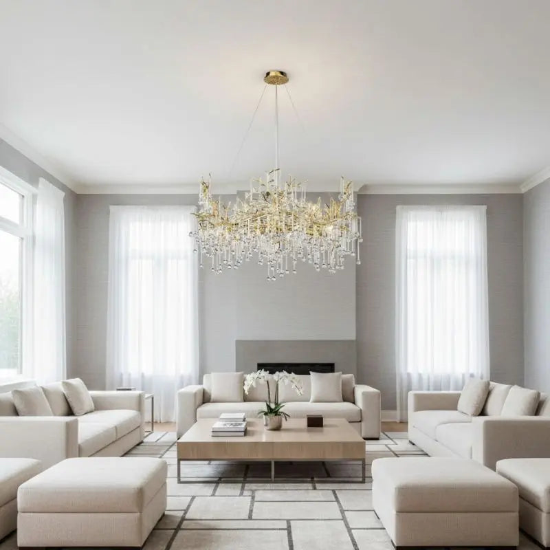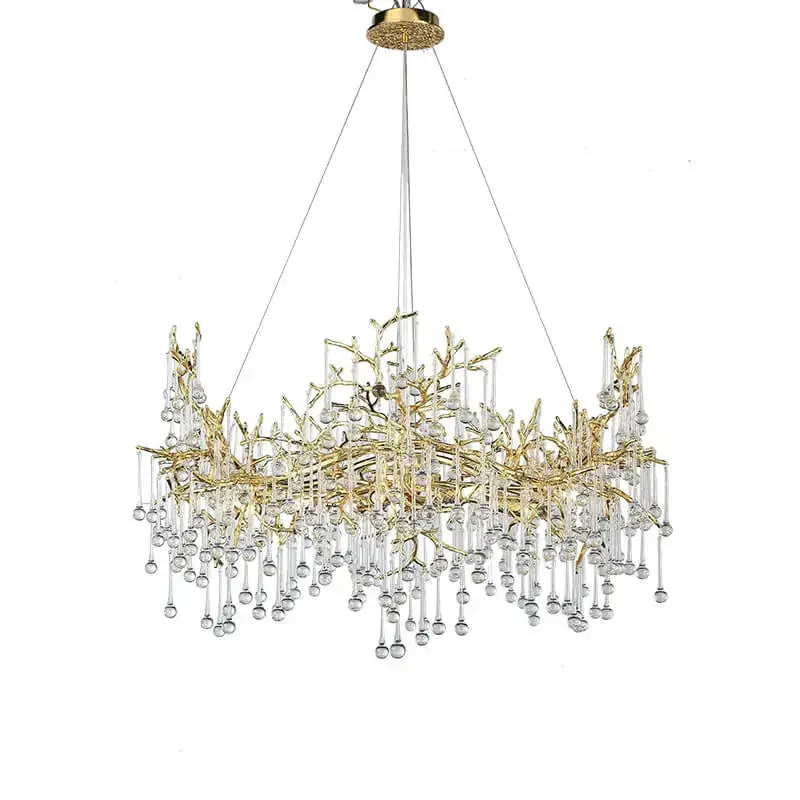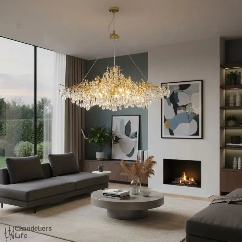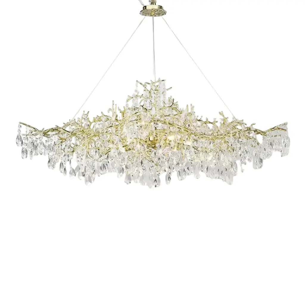
A beautiful island can still feel unfinished if the lighting above it is too small, too harsh or simply out of proportion. Kitchen island pendant lights do more than brighten a worktop - they frame the room, set the mood and often become the detail that makes the whole kitchen feel considered.
For many homeowners, this is where practicality and style need to meet without compromise. You want clear light for prepping meals, but you also want a fixture that feels elevated from morning coffee through to evening entertaining. The right pendant arrangement brings both, and when it is chosen well, the island becomes a true focal point rather than just another surface.
Why kitchen island pendant lights matter so much
In most modern kitchens, the island sits at the visual centre of the room. It is where people gather, where tasks overlap, and where the eye naturally lands as soon as you walk in. That is why pendant lighting above the island tends to carry more design weight than many homeowners expect.
A ceiling light can illuminate a room generally, but pendants bring structure. They draw a line through open-plan space, create a sense of rhythm above the island and help the kitchen feel layered rather than flat. In design-led interiors, that layering is often what gives a kitchen its refined, finished character.
There is also a practical reason they remain such a favourite. Pendants place light closer to the work surface than many flush fittings or recessed spots, which helps with chopping, serving and day-to-day use. The challenge is getting the balance right so the scheme feels luxurious rather than overlit.
Start with scale before style
It is tempting to begin with finishes and shapes, but size should come first. Even an exquisite pendant can look awkward if it is too bulky for a narrow island or too slight for a generous, statement-making space.
A long island usually suits either three smaller pendants or two larger ones. Which direction works best depends on the visual effect you want. Three pendants feel classic, balanced and often slightly more decorative. Two can look cleaner and more architectural, particularly in contemporary kitchens with strong lines.
The width of the island matters just as much as its length. Oversized fittings above a narrow island can feel crowded, while undersized pendants can disappear completely in a large open-plan room. If your kitchen has high ceilings, you can often carry a larger fixture successfully. In a more compact kitchen, a lighter silhouette such as clear glass or slender metalwork helps the space feel open.
This is also where honesty about the room helps. A dramatic cluster may look stunning in a showroom image, but if sightlines across the kitchen and dining area are important in your home, a simpler pendant profile may serve you better.
Spacing kitchen island pendant lights properly
Once you have the scale, spacing becomes the detail that makes the installation feel intentional. Pendants should sit evenly across the island rather than being centred only to the room. The island itself is the reference point.
As a general rule, leave enough space between pendants so each fitting has presence without competing with the next. Too close, and the row feels cramped. Too far apart, and the composition starts to break up. The outer pendants should also sit in from the island edges rather than lining up exactly with them.
Height is equally important. Hang pendants low enough to feel connected to the island, but not so low that they interrupt views or become intrusive during conversation. In many kitchens, a drop that leaves clear sightlines across the room feels most elegant. If the pendants are too high, they can look detached and lose their visual purpose.
If your household uses the island for everything from homework to hosting, a dimmable setup is worth serious consideration. Bright task lighting is useful, but softer evening light makes the kitchen feel more luxurious and far more welcoming.
Choosing a style that suits the kitchen
The best kitchen island pendant lights do not have to match every finish in the room exactly, but they should belong to the same design language. Think of them as jewellery for the kitchen - they can stand out, but they still need to complement the whole look.
Modern kitchens
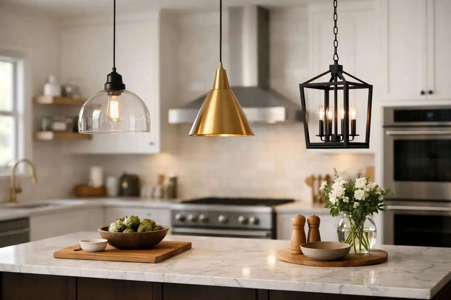
In modern spaces, clean shapes tend to work best. Linear metal pendants, sculptural glass forms and understated matte finishes all suit sleek cabinetry and minimalist detailing. Black, brushed brass and polished chrome remain popular because they pair well with contemporary hardware and appliances.
If your kitchen already has strong materials such as marble-effect worktops, fluted timber or dramatic splashbacks, a simpler pendant often creates the more expensive look. The room feels curated rather than crowded.
Classic and transitional kitchens
Traditional and transitional kitchens can carry more decorative detail. Lantern-style pendants, ribbed glass, warm metallic finishes and softly curved silhouettes bring character without feeling overly formal. These styles are especially effective if your island is painted in a contrasting colour and intended to read as a furniture-like centrepiece.
In these spaces, a pendant can echo the timeless elegance of a chandelier while remaining appropriate for everyday kitchen use. That balance of practicality and refinement is often what makes a kitchen feel enduring rather than trend-led.
Luxury statement interiors
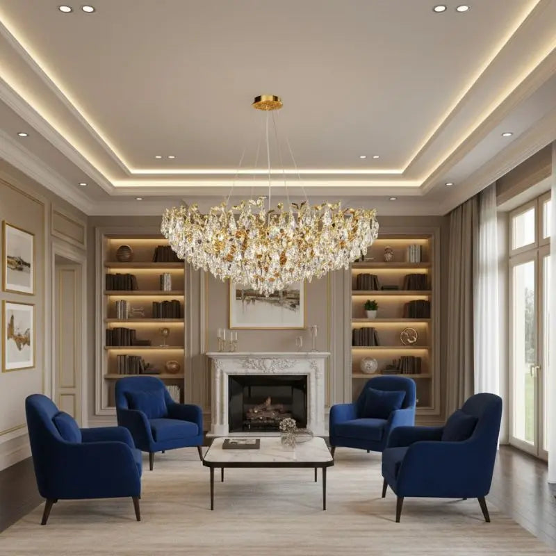
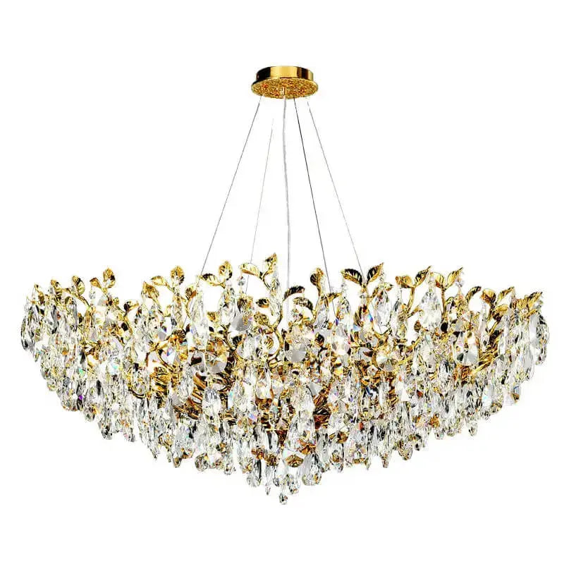
For homeowners who want a more elevated finish, pendant lighting is an opportunity to introduce richness through material and texture. Crystal accents, alabaster-inspired shades, smoky glass and refined metal detailing can all add depth. The key is restraint. Luxury lighting should feel confident, not excessive.
A statement pendant works especially well when the rest of the kitchen palette is disciplined. Neutral cabinetry, stone surfaces and tailored seating create the right backdrop for a more expressive fixture.
Light quality matters as much as appearance
A pendant may look exquisite in daylight, but if it throws glare across the worktop or leaves shadows where you prep food, it has not fully done its job. This is why shade material and bulb choice matter.
Opaque metal shades direct light downwards, which is excellent for task use but can feel more focused and dramatic. Glass shades allow more ambient spread and can make the room feel brighter overall, though clear glass sometimes exposes the bulb more than homeowners expect. Frosted or lightly tinted glass offers a softer effect and often feels more polished in daily use.
Warm white light usually flatters kitchens best, especially in homes where the kitchen opens onto dining or living space. It keeps stone, timber and painted finishes looking richer and more inviting. Very cool light can make a beautiful kitchen feel clinical, which is rarely the mood people want at home.
Common mistakes to avoid
Many island lighting problems come down to proportion and planning rather than the fixture itself. One of the most common mistakes is choosing pendants that are too small because shoppers worry about overpowering the room. In reality, slightly generous scale often looks more premium than fittings that feel timid.
Another issue is treating the pendants as an afterthought once cabinetry and finishes are already fixed. Because they sit at eye level, they deserve to be part of the design conversation early. Their finish, shape and light output all affect how cohesive the kitchen feels.
It is also worth resisting the urge to follow every trend. Highly sculptural designs can be beautiful, but ask whether you will still love them in five years. A timeless silhouette with a distinctive finish often gives you the best of both worlds - visual impact now, lasting appeal later.
When one pendant, two pendants or three make sense
There is no single formula that suits every island. A smaller island may need only one larger pendant, especially if the fitting has enough width and presence to anchor the space. Two pendants often suit medium-length islands and create a clean, balanced look. Three are ideal for longer islands or for homeowners who want a more classic rhythm overhead.
The right answer depends on island size, ceiling height, sightlines and how decorative you want the lighting to feel. If the pendants are intended to be a standout feature, fewer but larger fixtures can look especially refined. If the goal is symmetry and softness, a row of three may be the stronger choice.
For shoppers browsing online, this is where a curated retailer can make the process feel far easier. ChandeliersLife, for example, speaks to homeowners who want statement-worthy design without losing confidence in the practical side of buying - from finish selection to support and delivery reassurance.
A final design thought for a more polished kitchen
The most successful kitchen lighting rarely comes from choosing the boldest pendant in the room. It comes from choosing the one that makes everything around it look better - the island, the cabinetry, the seating and the space as a whole. When kitchen island pendant lights are scaled well, hung with care and chosen with both beauty and function in mind, they bring a sense of quiet luxury that stays with the room every single day.